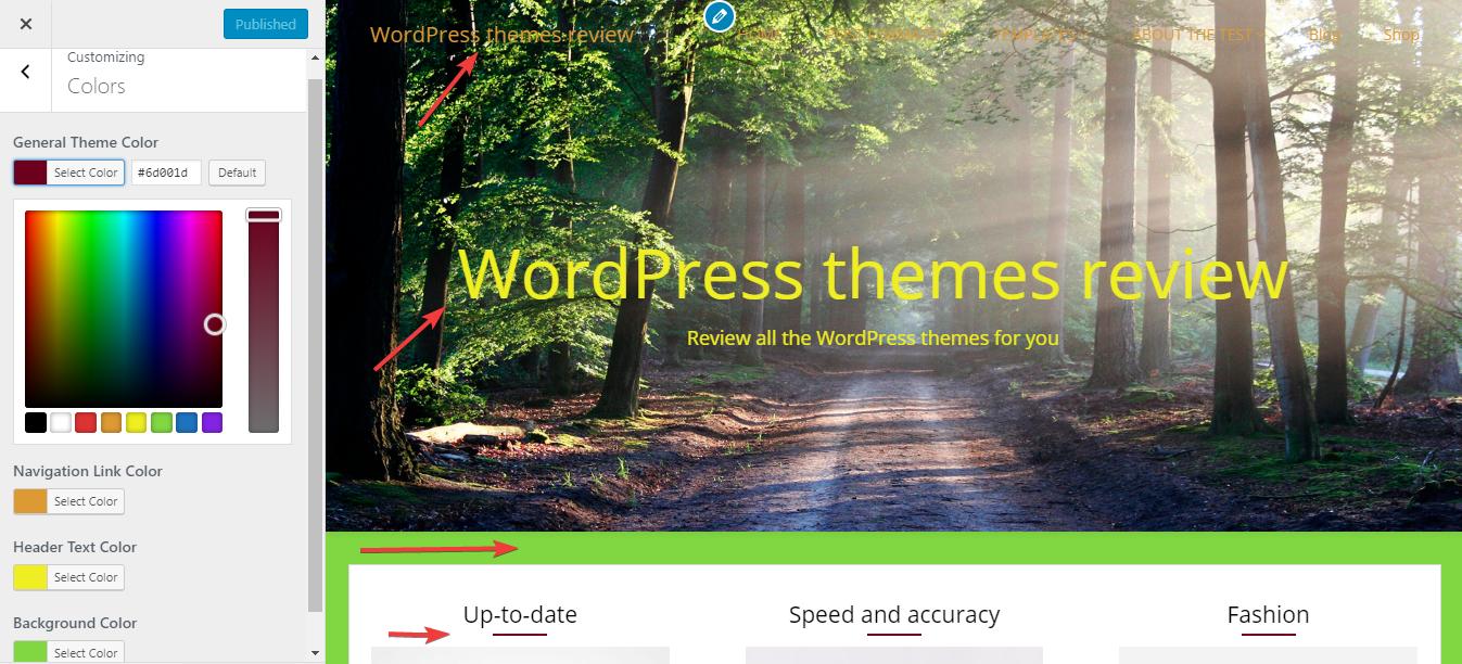
General design
The design of this Free WordPress theme is the harmonious combination of both box layout and full-width layout. More specifically, the default style of header and footer are full-width and that of the body is the box-content layout. The box layout and list structure of the body plays an important part in the neatness and simpleness of the whole site. Meanwhile, the full-width layout makes the design super open and attractive. In this design, I see the primary elements are built from straight lines. On the other hand, the minor element like buttons and social icons are made from curved lines. Generally, this design brings about a sense of elegance and gentleness.
Other elements
Besides the classic color like white, light grey and black, the author also uses orange and green in some highlight part to make this theme less boring.
From the top to the bottom, the author uses only the traditional Open-san font. This font makes the texts super clear and legible.
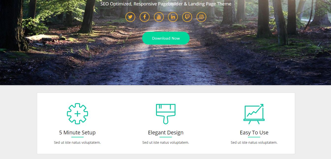
The most outstanding element of this theme is the powerful full-screen header image. The title, tagline, and menu lie on this image to save the space and give direct attention. Yet I think that the menu title looks quite unclear on the image.

Header image
This theme provides you with up to 3 widget areas: footer, sidebar and header widget. The sidebar is on the right of every page. Each widget in it is arranged in an individual box and looks very well-organized. The header widget can also be a place where you display your project or profile. The 3 widgets are put on a mutual box so this area can have a sense of "smooth".
Top widgets
Next, I see that the thumbnails on the archived post page are large and attractive but there it's not shown on the single post page. The lack of a featured image and even the header image makes the single post page really simple. From my point of view, this default style is not able to impress people and even make this site quite boring.
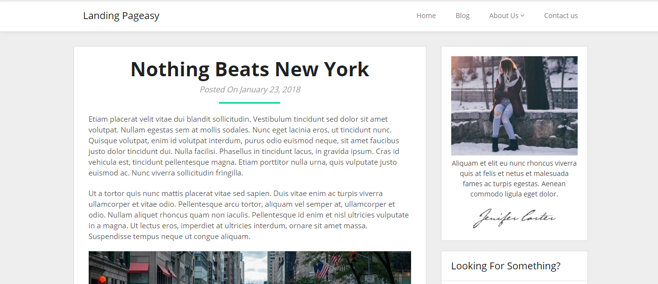
Single post page
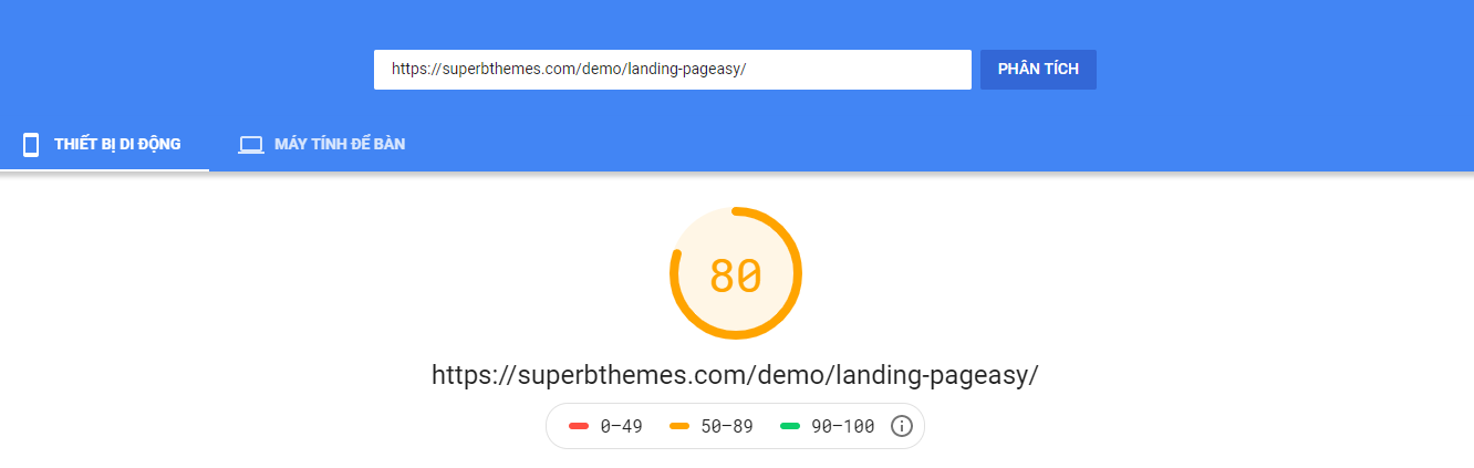
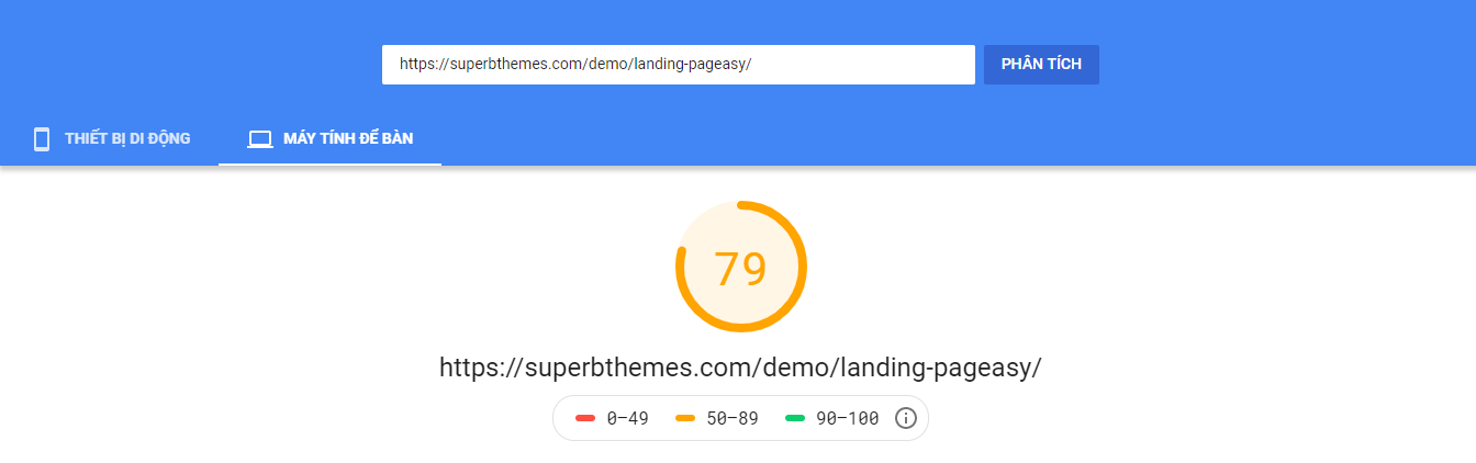
Responsive
This WordPress theme works well on every device. What I mean is that the design looks fine without any problem in PC, laptop, tablet or smartphone. You can see the responsive design check by ami.responsivedesign.is.
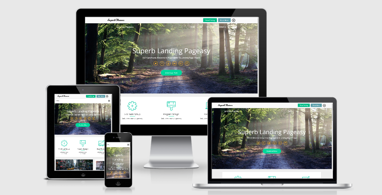
Responsive design checked by ami.responsivedesign.is