General design.
The design is super simple and minimal. You can hardly find any unnecessary elements in the general design or even some decorative details. It just concentrates on how to display the post most effectively and clearly. The author uses the box layout to put all the contents in separate boxes, and the boxes are put in a list structure. Therefore, it looks extremely clean and tidy.
In general, this theme looks decent and quite "humble".
Other elements
The main choice of color follows the elegant and cool style. The light grey, black, and white is mainly used for the background, boxes, and text. But I don't think that the light grey text should be used on the white background of the boxes. That choice makes the text so hard to read. Besides these classic colors, the author adds orange color in an effort to make the theme less boring and to highlight some parts.

Throughout the theme, Lato is the only font that the author uses. It's a safe choice to make the word readable but with only one kind of font, it's quite repetitive. Thus, the reader may find no emphasis on your website.
As I said before, the appearance of this theme is very simple, and to some extent, it's a disadvantage. There are no header title and tagline on the header area, only a sticky menu bar lies here. I think that at least the reader should know the name of the blog or magazine that they are reading.
Having no title and tagline, it also has no sidebar. I can accept it as it helps the reader concentrate on the body content more. At least there are still 3 footer columns laid on the black background. They are arranged neatly and symmetrically with the boxes content above.
On a single post page, all elements like featured image, title, and information look nice. The line spacing is adequate, which give me a sense of "flow". I also like the way they create a large ticket to submit the comment. If I'm a reader, I will be so pleased to write my comment here.

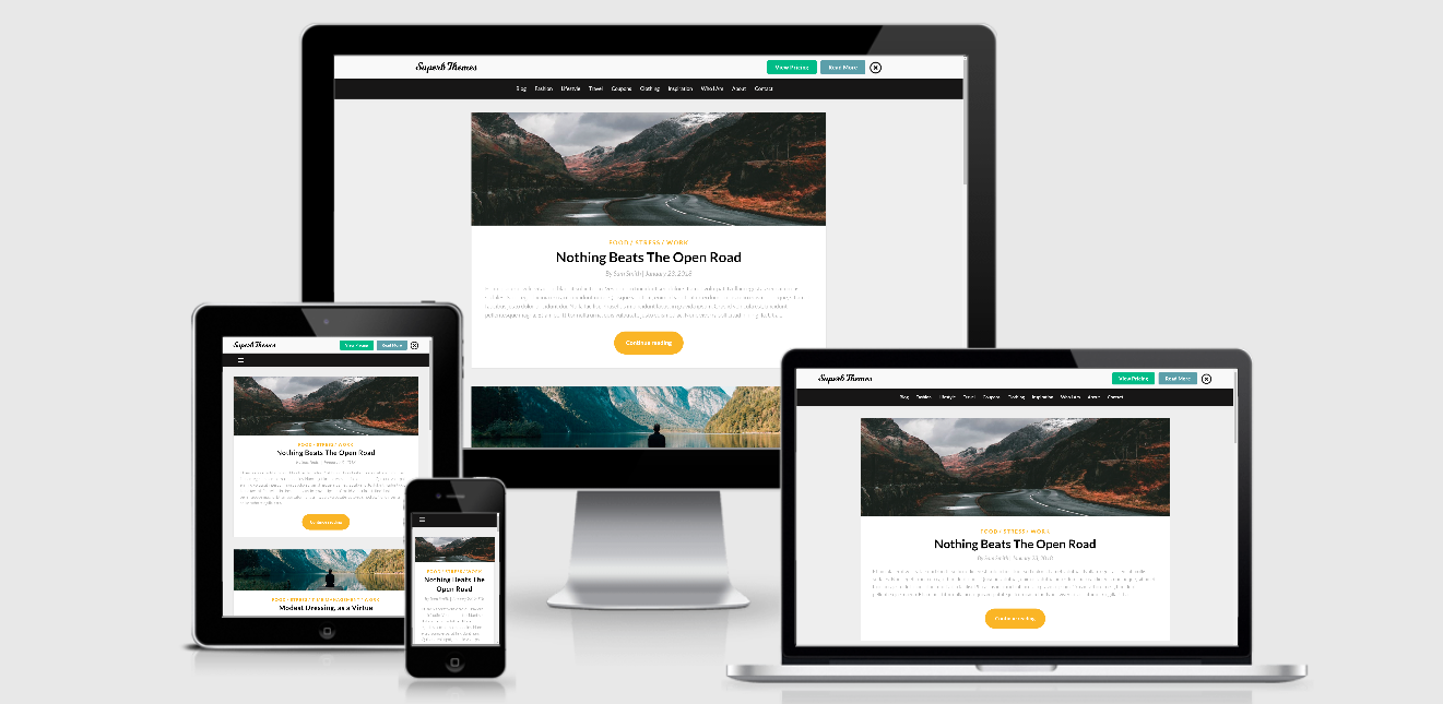
Responsive
This theme works well in every device like computer, laptop, tablet or smartphone. It means that the design still looks good without any mistake in different size of the screen. You can see the example responsive design checked by ami.responsivedesign.is
responsive design checked by ami.responsivedesign.is


